Showing posts with label High School. Show all posts

Monday, June 15, 2015

Graphite Portraits

For our final drawing project, we decided to get down to business! People are easily one of the hardest subjects to draw because if you are just a little off, it won't look right. That being said, my students BLEW ME OUT OF THE WATER with what they accomplished. We began the lesson by having everyone draw a portrait with no instruction and then I showed them the most commonly made mistakes when drawing the face. We then went through the rights and wrongs of drawing lips, eyes, noses, and hair.

After demonstrating how to sketch and measure the dimensions of the face, the students were off! Each with a picture of a celebrity, they patiently drew for the remaining weeks of school.
Talitha Call, grade 7, drew Lindsey Stirling. Teeth are hard and she nailed it!


Rebecca Ross, Grade 6, drew Taylor Swift.

Larisa Kozhevnikova, Grade 10, drew a Russian celeb whose name now escapes me...

Vincent Baird, Grade 7, drew Tim Tebow.

Amariah Adams, Grade 9, drew Jennifer Lawrence. The Charcoal was an excellent touch to made this portrait really pop!
Julia Fox, Grade 8, drew Emma Stone. They actually look very much alike and she did wonderful!


As a teacher, I am tremendously proud of how well everyone did and of all that we accomplished this year! I'm going to miss my amazing artists!

Sunday, June 14, 2015

Color Theory T-Shirt Designs

To top off our unit on color theory we challenged our students creativity and knowledge of color schemes. Each student was tasked with the goal of designing 4 t-shirt designs that represent 4 different color schemes. 

As per usual, craftsmanship was of utmost focus for this project. It seems elementary to teach MS and HS students to color, but it pays off.

Here, Chloe uses monochromatic, complimentary, primary, and warm color schemes.

Marie implemented analogous, cool, secondary, and primary color schemes.

And Angelina used warm, monochromatic, cool, and complimentary color schemes.

As always, it was so fun to see everyone's personalities show through their designs and how they implemented the various color schemes.


Sunday, June 7, 2015

Mendhi Hand Casts

Henna has been used for hundreds of years and is a natural plant dye. When applied to the skin, the henna produces a temporary stain. Mehndi is the Hindi word used to describe the art of henna. Traditionally henna is applied on the hands and feet and is used for weddings and religious occasions such as Eid, Diwali and for the blessing on the birth of a child or to bring good fortune into one’s home. Today henna is also used to temporarily decorate your body, as a form of self expression and body art. There are many symbols used in Henna meant to bless the one adorned with the artwork.

Naturally, I wasn't going to assign your children to tattoo each other up, but this seemed like a new opportunity to create a cast sculpture while learning a little bit more about other cultures!

Before doing anything we learned how to draw various henna symbols and designs. The students were tasked to sketch and ink various symbols that best represented them such as the following:
Peacocks ~ beauty
Swans ~ success
Birds ~ messengers (between heaven and earth)
Dragonflies ~ rebirth
Fishes ~ a womans eyes
Flowers ~ joy and happiness
Vines and leaves ~ longevity, devotion, perseverance, entwined lives and vitality
Tortoise ~ Protection and fertility
Lotus Blossom ~ the light within / the awakening of the human soul. Grace, beauty, creativity, sensuality, femininity, and purity.
Sun, Moon,and Stars ~ deep and lasting love between lovers/partners
Paiselys ~ represent fertility and good luck
  Next we used plaster strips to create a plaster cast of our hands. Casts are the initial step in making molds, and it a pretty fun process!


After making two half casts, students attached them together to create a complete mold. Then, after sketching their designs onto their hand cast, students painted their "henna" on. I mean, come on-how cool are these?!


Saturday, May 9, 2015

Analogous Color Organic Pop-Art


Color is the element of art I could probably spend the most time on, because there are SO many color schemes to focus on! For our first project I will admit I went a little out of order. Generally one would start with Primary colors (Red, Yellow, and Blue) and then branch out from there, but I feel my students generally know how to mix colors, etc.  So, we jumped right onto analogous color schemes. I like to call these colors "next door neighbors." Analogous colors are those that blend into one another on the color wheel (as seen below).


For this project our primary objective was CRAFTSMANSHIP. It sounds silly at this age but I think it is SO important for students for be able to cut a smooth even line. For future presentations, scrapbooking, matting, framing, really... anything, craftsmanship is crucial because the presentation of an idea or item is everything. Drawing back upon our knowledge of organic shapes, our students designed a abstract, organic shape and color scheme, and then cut layers upon layers of paper getting a little larger each time with even borders. Then, they literally made their artwork POP! Using small squares of cardboard the students glued each layer raised off the surface of the next. All together they make for a very exciting art installation! 

 
Make sure to stop by the hall across from the office and check it out!


Saturday, April 25, 2015

Texture Slab Sculpture

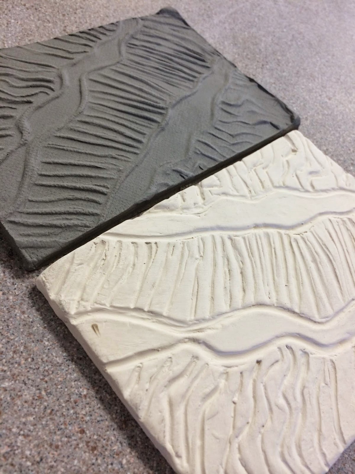
Because we had yet to really do subtractive work with clay, I decided it was time to try a little carving. To begin, our students pre-drew a series of zentangles to practice designs and rhythm that would look nice transferred into clay. After sketching, students received a slab of clay that they carved the design out of. After being cooked, fresh clay was rolled on top of the slab to create a protruding design. Then, students built a vessel out of their textured slabs. I know that we are seeing a lot of bowls, boxes, and cups in sculpture, and call me uncreative, but I just feel like items with a purpose are kept longer, appreciated more, and that students gain greater satisfaction in seeing their sculptures being used! I wouldn't want a giant clay shoe laying around my house... but maybe that's just me!

Here is an example of a before and after of the clay slab and it's transfer:
and here are the finished products!


Though this was fun, I'm so excited to see the outcome of our next project, so keep your eyes peeled for it!


Hand-Lettering Quotes

So, I will admit this project is a little out-dated. We actually did this one after calligraphy and before letter-illustration. 
The objective for this project was to create the illusion of a calligraphy or brush pen while only using a normal pen. Hand-lettering is SO popular right now (if you have a Pinterest account, you know!) so, it was fun to experiment with hand-lettering a bit. Some students chose the same quote that they used during calligraphy while others changed it, but as usual the variety was amazing! Students were supposed to use at least two fonts of their own design, implement various font sizes and they needed to fill an imaginary shape (oval, square, etc.) 

Amen, Amariah!

We have a trekkie in our midsts! Love it, Talitha.

I love the "swashes" Julia added here.

Isn't this so true? Great shape Larisa!

Though this project came with it's fair share of challenges I thought they did wonderful. Is there anything these kids can't do?!


Thursday, April 9, 2015

Illustrated Letters


Our drawing students are basically professional type artists by now, having learned calligraphy, hand lettering, and now letter illustration!  For this project the objective was simple: Design and draw letters that represent you and your interests! I think the character of each student is pretty obvious with what they came up with!

This student is all boy!

Musical anyone?

Is anyone else mesmerized by these sea themed letters?

With the summer coming up, it's fair to assume Talitha is excited!

And I may be biased... but I'm a huge fan of this chica's hobbies!

It's always so fun to see the variety of students we have shine through. Until next time!

Trompe L'oeil Sculptures

Our focus for this sculpture project was inspired by an art term- Trompe L'oeil
Trompe L'oeil means "to fool the eye".  Rene Magritte is a wonderful example of an artist who brought this term to light with here oil painting "This is not a pipe" seen below.
Obviously, it's a pipe.... but really, it's not- it's just a painting of a pipe. You cannot smoke it, or hold it, it is just an image.
Our sculpture students were given the task to draw, design, and sculpt an item that is not what it appears.  We have many items that double as dishes or jewelry holders such as a flower, leaf, football... and a few pinch pots disguised as a cupcake, apple, and beehive.


This cheesecake is actually a pencil holder!

While this bird bath makes a great jewelry dish!
Seeing all the ideas were fun, but the final glazed products were even better!

One-Point Perspective Orchard

For the element of Space we went pretty basic to emphasize how space affects size, color, and composition. After learning how to line objects up to a vanishing point, our students chose a specific tree, and their favorite season to draw it in. 
The medium of choice for this project was oil pastels! These are so fun to work with because of the various ways to blend, the strong and bright color, and the control you can have with them because they are in a solid stick form. Overall, I think everyone had fun experimenting with them!

We had a huge variety of trees, colors, and seasons which makes these SO fun to look at!


Everyone was so impressed with Daniel's bold sunrise orchard.

And there is a beautiful split-complimentary color scheme here done by Vincent!
Overall, this has proven to be one of my favorite projects, and hopefully one of the student's favorites as well!