The second approach we took with the element Space was to learn how to manipulate distance, or rather the space between subjects and each other, and the subjects and the viewer. Using the visual below, we identified how items far away are higher on the page, smaller, and duller in color. Items close up are larger, lower on the page, and brighter.
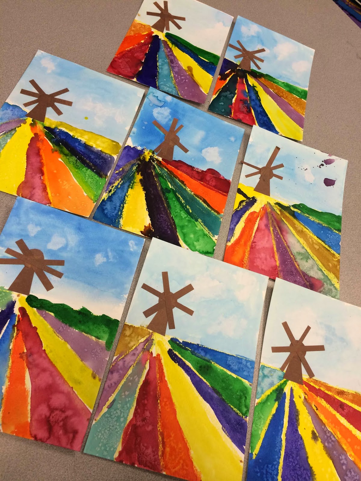
K-1 worked with watercolor to create some European tulip field inspired paintings.
At their wee age, they conneted points on the bottom of their paper to a vanishing point to make the feild appear to disappear into the distance.
They learned that if you dab your wet paper with a tissue, a cloud effect is created. They also saw that if you sprinkle salt on watercolors the colors are absorbed creating a cool "flower" texture. This also creates a "snowflake" texture for our 4/5 classes further below...
The 2nd and 3rd grade classes learned about foreground, middle ground, and background with the help of some pop-up cards. In order to make this project completable in 35 minutes, most peices were pre-cut. They did have to cut many parts in half, design their own clouds, and assemble their scene. They did a great job of following multiple directions.
The concentration was so thick you could cut it with a knife.

Great Job Hyrum! Corinne and Janeya showed their mastery of space by placing the smaller items farther back into the distance, and the larger ones close up.
When painting our "winter birch trees" the 4th and 5th graders focused on identifying the light source in order to choose the direction of their shadows, and where to place the trees along with what size the trees should be in order to create a realistic scenery. This combined with that new watercolor techniques involving salt made for a beautiful project.

Trinity is excited about how her scene looks when she removes the tape while Sam continues doing the same.
Waylon and Daniel add their birch tree details with India ink.
Abigail and Nikolay focus intently.
What an incredible, violet sky Abigail made.
Samuel's is very soothing to look at.
Artwork like this almost makes me sad that winter is coming to a close.
.....Almost ;)


.JPG)


No comments:
Post a Comment
Your thoughts are important! Thank you for sharing them.